MIAD FLAG DESIGN
|
Milwaukee Flag
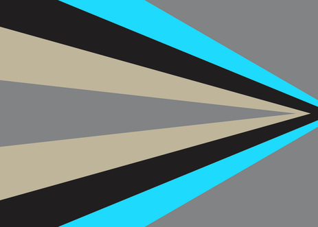
MIAD Flag Project 17.78 X 12.7 centimeters November Exhibition text: The current Milwaukee flag needs to be changed. Not only does it not fit with modern Milwaukee, I don't think it ever fit Milwaukee at all. That is why I have re designed The Milwaukee flag to better match what we want to be known for. |
Planning
|
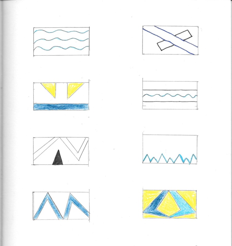
First our class watched a video, and got a presentation from MIAD about flag making. There were some key points that I learned, that should be in a flag,
-There should be meaningful symbolism -Simple color scheme -No words or seals -Be very distinct -Use 1x2 in. boxes for sketching. I started with some very basic flags when sketching. I used water as a paramount feature in almost all of my ideas. I also looked at other flags, and still had some good flags in my mind from the presentation. In the end I chose the sketch in the bottom left hand corner. I was going for an "M" like shape that also looked like a river. However this was only the beginning of actually making my design. I chose to cut out the "M" idea because when looking back at the key points to making a flag, there shouldn't include any words, and although it was just a letter I felt it was to close to breaking that rule. |
Process
|
The process of making the flag started with the image on the right. I used Adobe illustrator to create basic shapes using the pen tool. I find that the pen tool in adobe is excellent for trying to get simple shapes. however this was only an idea, I had not put in the time and effort to make sure the flag was symmetrical.
|
|
Next I cut down the beginning draft, as shown in the following slide. I was thinking about keeping an "M" in the flag, but thought to avoid lettering and follow of the critical parts of flag design.
|
|
After This I felt that I should focus entirely on the wing shape created by the stripes, and I cut the excess. While doing this step I also Thought to highlight one side of the design and reflect it, this made sure that the final product would be symmetrical. This vertical flag was what I had to show half way through the process, and after getting feedback that it might not be a plausible pick if it is a vertical flag, I then decided to make it horizontal. This change was not all negative, By doing this I still retained many of the same symbols, and also now looks like the greater than sign. |
|
Symbolism and Culture
In the final flag design that I came up with, the colors that I chose all have a meaning to them. The lighter blue is representative of the lake. I wanted to chose a blue representing the water that Milwaukee was directly next to, but I didn't want just any blue. The lighter blue is more upbeat and positive, conveying Milwaukee's attitude. The water can also remind people of Milwaukee's past as being the most populated city in america, and how many relied on the trade over seas that took place in the docks. The black and grey are both colors that represent the industry in Milwaukee. Milwaukee was a large part of the industrial movement in the past, and there are some companies that represent our manufacturing past like Harley Davidson, one of the largest motorcycle brands in the country. Finally the cream colored stripes symbolize the cream buildings that Downtown Milwaukee is known for. Also this cream color is representative of the large brewing companies in Milwaukee. Also by making this flag horizontal, it also looks like the > sign helping to convey the message of change.
Inspiration

|
The flag that I used as inspiration was the South African flag. The Creator's, name is Fred Brownell. It is also very ironic that this was flag was created to promote change in South Africa, and How I created my flag to change how Milwaukee is seen. I really love the design of this flag, I feel it is so unique, yet it still follows some of the key guidelines to making an excellent flag. I really used the idea of making shapes out of different stripes in my flag. I also use different colors for each of my stripes like Fred Brownell does when making his flag.
|
Reflection
What I Felt I Did WellWhen looking at other successful flag designs I tried to emulate the clearness, and flow of excellent designs. I felt I did this well. I Also believe that I was able to follow a good color scheme. All of the colors worked very well together, and each had some kind of meaning behind them.
|
What I Could Have Improved OnI Think that I could Have Improved on the way that I had created the flag. What I mean is, next time I use Adobe Illustrator I want to take advantage the margins, and various other tools to determine the length and width of the shapes. I am happy with the final product, however If I had paid better attention to the different lengths and widths, then my flag would have been easier to make, and more professional.
|
Citations
South African flag image- "Flag of South Africa." Wikipedia. Wikimedia Foundation. Web. 19 Nov. 2015. <https://en.wikipedia.org/wiki/Flag_of_South_Africa>.
Information on the origin of the flag and its creator- "Fred Brownell: The Man Who Made South Africa's Flag - BBC News."BBC News. BBC, 27 Apr. 2014. Web. 19 Nov. 2015. <http://www.bbc.com/news/magazine-27155475>.
Information on the origin of the flag and its creator- "Fred Brownell: The Man Who Made South Africa's Flag - BBC News."BBC News. BBC, 27 Apr. 2014. Web. 19 Nov. 2015. <http://www.bbc.com/news/magazine-27155475>.
