|
Find The Path
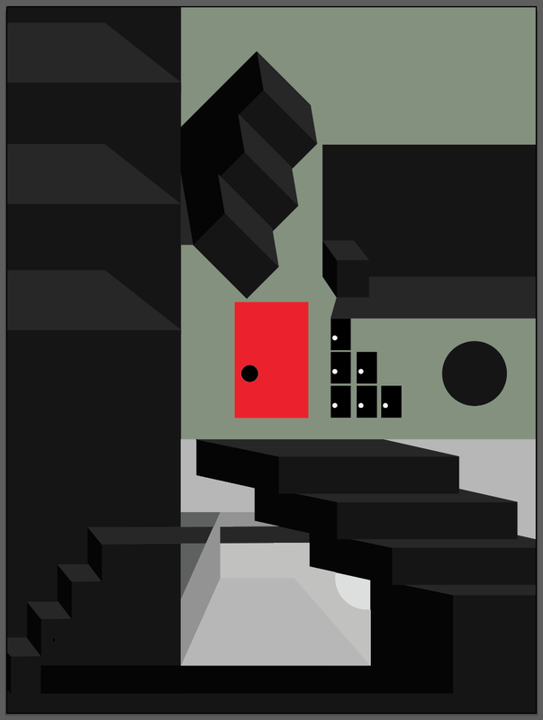
Drawing through digital media December 30.48 X 40.64 Exhibition text- I used adobe ilustrator to create shape, line, and form similar to Whiteread's creation of these things throguh sculpture. While Reed may feel it is easiest to create meaning work through sculpture, I had more success with digital media. |
Inspiration
|
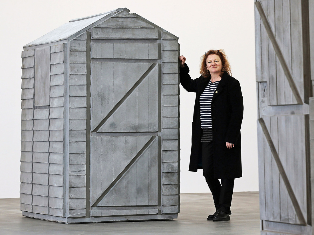
Rachel Whiteread is an artist that I looked at for my found object peace, for UWM. I really enjoyed her use of form, and line within form. I wanted to go back to this artist and re-look at what techniques, and what I could do in order to successfully emulate her work. Looking at her peices, the first thing I notice is the lack of use of hue. Her sculptures are typically white, but can be anywhere on the gray scale. Hue seems to be less important, but what is important, is the shadows created by the form. These shadows created by the light sources, add different tones of the color of the object itself. I knew I was going to have to make my shadows meaningful. The space that the objects is placed is also important since many of Whiteread's peices feature outside scenery. Clearly it is not just the object made that is important, if that were the case, im sure that Whiteread would merely photograph each work with a white or background color that wouldnt affect the peice.
|
planning
|
|
|
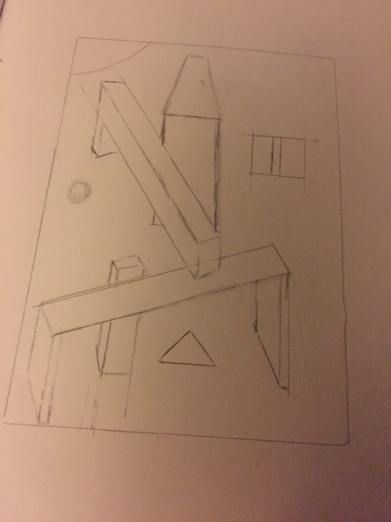
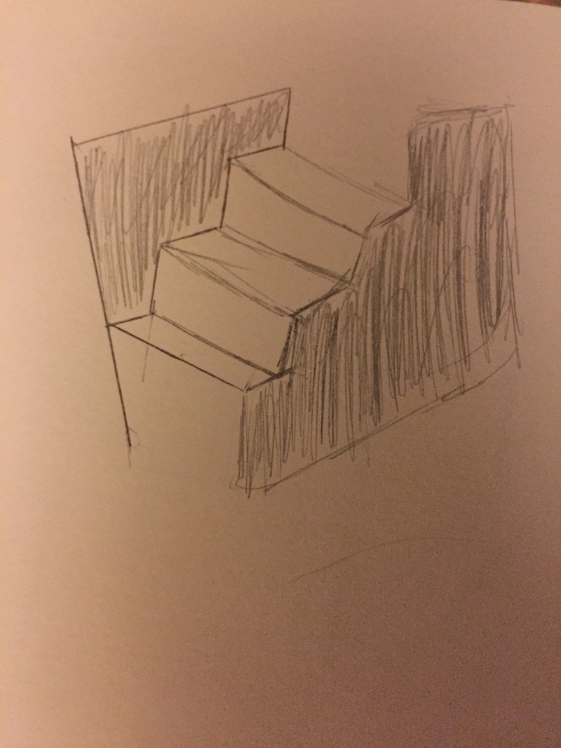
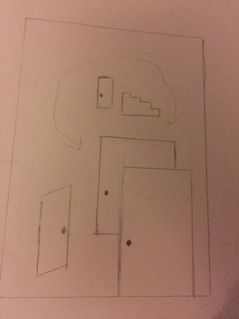
I started by making sketches with geometric shapes, I wanted to mess with the idea of doors, since they are an opening to a path way, as well as stairs because they are how we elevate ourselves to a higher level. The sketch of the stairs is an optical illusion, which is important, because many pathways we may take in life can be incorrect, or misleading. I developed a way of viewing the piece, starting from the middle then going around. I wanted the viewer to follow my direction.
Process
|
|
I started by using my sketches as a reference point. I opened up a document in adobe illustrator and wanted a focal point, in my sketches I had worked with many doors. The starting image that I used was a red door, using my understanding of hierarchy, I knew a red door would be the right way to start the piece and it is dead center on the page. Once I established my starting point, I created a building block that I would use to help guide my decisions. I made a small box shape, I established that the left side of the box would be the darkest, then the front, and the top would be the lightest. This block was the sort of way to keep my forms consistent. I started by creating a stair way from doors, this was going to lead up to the cube, within its own space. This small cube symbolizes the quick options we all have in life. It is like the first option for our eyes to rest. Then I wanted a pit fall, and to do this I created stairs from my references, however they were falling, to do this the stairs angle down back to the door. after the steps comes a de-escalation with large pedestals that lead to a path way across the piece. This was done using a different angle of block. I used my refrences for ideas of how to represent each of the shapes with adobe illustrator. Then the path way sort of leads to this hidden area, with a hidden light source. This is what we are all searching for, people think its hard to find joy, or they say, "its right under my nose" however I wanted to convey that the joy in life is easy to find, because it sticks out from all the rest. it doesnt stick out like a bright red door, but rather a scene that is mysteriously different.
|
Reflection
I felt That I was successfull in using several design principles to create a piece, about a journey that we all must take. The red door is the focal point it's where you start, and you must choose where to go from their. I believe that we all might get a handful of obvious choices, and that is it in our life. I think that I was effective in developing my meaning through the work. One think that I struggled with was developing a path for the eyes. I wanted the viewer to follow my lead, however I think with some pieces being so close together, there is unwanted attention drawn to varying paths.
ACT
1) My inspiration, was Rachel Whiteread , specifically her work in sculpture.
2) My point of view on design, is that it uses harmony to convey order. This order is overshadowed by the man at the top, which is perfectly centered on the page, adding to the balance.
3) People need to be drawn in to art, if you don't create a space for them to pay attention, you will lose them. Meaning, needed to be clear, using unity to present the most relevant is crucial for an artist.
4) The theme of the research was why does Whiteread make the choices to orientate the the objects, outside. Why does the background seem so important to the sculptures? How can I create a background that has a meaning like Whiteread?
5) I found that the contrast of black shapes to the green in the background creates contrast. Also by reducing the amount of varrying symbols, the viewer can focus better on what is left to find the meaning. Which is why I used reacuring images, like the door, and steps.
Citations
"Rachel Whiteread: A Lesson in How to Think inside the Box." The Independent. Independent Digital News and Media, n.d. Web. 10 Dec. 2016.
