Spotlight
|
photography, manipulation
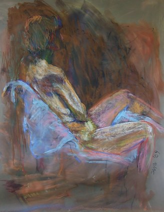
30.48 X 30.48 december Exhibition text- This piece was inspired by Sally Duback's work, specifically her work with chalk pastels. She has many works that focus in a specific point like the face, which is so important. I wanted to emulate her work through this piece. |
planning
|
|
|
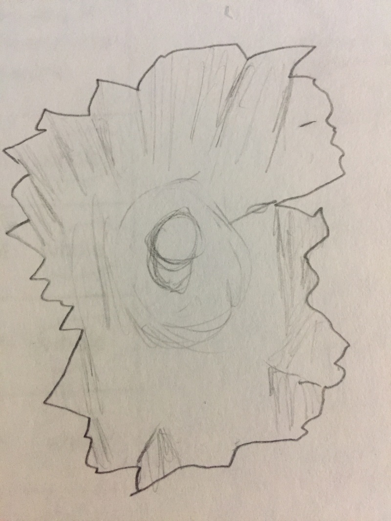
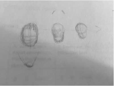
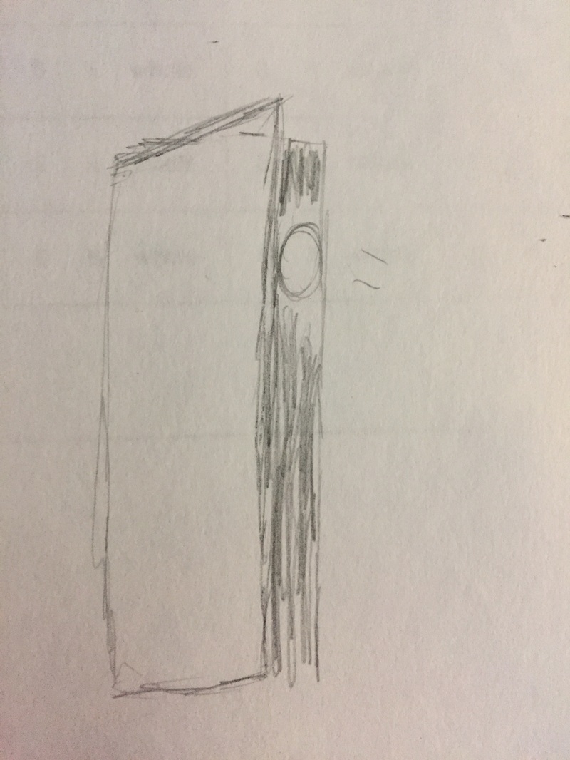
I started by making some work similar to Duback's, and referring back to techniques used in German expressionism. I started by using graphite, then tried using other mediums, but for my sketches I stuck with graphite. I wanted to explore the idea of a face being illuminated while having a background that is darker. I wanted to practice having different light sources on a face, this was to remind myself later when taking photos, what key orientations were needed. The face was going to be the focal point of the piece, I wanted to make sure that the there was harmony in the final product, and a symmetrical
Inspiration- Sally Duback
|
Sally Duback, the artist that I saw during the gallery visits, creates portraits of people with oil pastels, this artwork reminded me of the German expressionism movement. The german expressionist movement was a movement that used line, and heavy contrast in order to express deeper meaning, typically pain and sadness. This was an important element that I needed to pay attention to in my work. My use of Hue would be crucial in my work, which is why I would use varying tones of one color. I didn't want to stick to black, but I thought to use darker colors to again use my inspiration to my advantage
|
|
Process
|
|
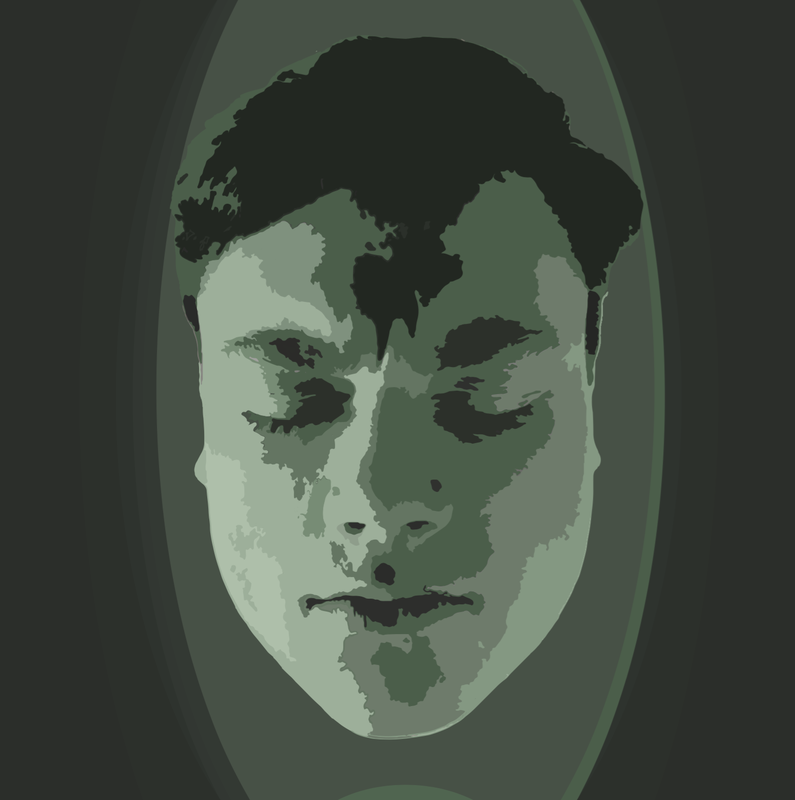
I started my work be creating a decent background to take photos of my face over, This background would be more useful for me if it was white, so I used a large white sheet of paper as my background. The white background was to help with the cutting of the face in photoshop. I had two lamps to work with, one I used to light the background and the other, I used to orientate in different positions. I followed my sketches and thought of my inspiration. Looking back at my inspiration I thought to close my eyes and have a slight tilt down, this was to symbolize my pain and guilt that I felt. I was most happy with this orientation and took it to photoshop to cut out the face. Once the face was selected and cut and pasted on a new document, I used the filter option on photoshop. I used the “cutout” filter, but I adjusted it to become more simplified, and smoother. After this I put the photoshop file in illustrator to add a background, and develop my own color scheme. I made the photo into a vector, so thus I could select each of the simplified shaded pieces. I started with the darkest pieces, and made them a dark green, working my way to the highlights, making them the lightest. To add a background I used ellipses to create emphasis on my face. The final touch was adding the indication of a small light source at the bottom of the face, like my guilt was on display.
|
Reflection
I believe that I was successful in using my inspiration to the fullest. I enjoy my comparative study artist, I believe that she uses symbolism so suddelly yet clear for all to see, That was my goal for this peice. I wanted to display my guilt and pain for all to see. The green represents the sickness that I feel, and that most feel well guilty. I am closing my eyes tight in the photo, this is to show the pain. Overall I am happy with my symbolism, and technique through digital manipulation.
ACT
1) My inspiration, was Sally Duback, specifically her work with chalk pastel.
2) My point of view on design, is that it uses harmony to convey order. My piece is centered, and sort of solidifies into the background similar to Duback's chalk pastel work.
3) People need to be drawn in to art, if you don't create a space for them to pay attention, you will lose them. Meaning, needed to be clear, using unity to present the most relevant is crucial for an artist.
4) The theme of the research was why does Duback make the choices to use such dark hues encasing a person? Why does the background more blank? How can I create a background that has a meaning similar to Duback?
5) I made the inference that the outfit of the man was for business. The contrast of black suit to the nature in the background creates contrast. Also by reducing the amount of varrying symbols, the viewer can focus better on what is left to find the meaning.
Citation
Duback, Sally. "Sally Duback Studio." Sally Duback. N.p., n.d. Web. 13 Nov. 2016.
