MIAD
Graphic Design
|
A three week pre-collage course teaching the basics in terminology, and how to translate those rules from definition to design using different mediums. We were encouraged to use adobe illustrator and photoshop but weren't limited to those programs and could even physically make some of the products.
|
|
1) My inspiration, was the knowledge I gained from taking the course, learning about hierarchy, proximity, and contrast, and how they affect the purpose of design.
2) My point of view on design, is that it uses form and shape to convey similar meaning with symbolism as other mediums do. It can convey a theme just as deeply as any other medium can.
3) People need to be drawn in to art, if you don't create a space for them to pay attention, you will lose them. Society wants things as fast as possible, including meaning, using hierarchy to present the most relevant is crucial for an artist.
4) The theme of the research was why do certain design look more aesthetically pleasing than others? How can one design use less form and line, still convey a deeper meaning?
5) I made the inference that the hue red, and or the contrast of black and white is a simple way of making a shape more important. Also by reducing the amount of shape in a design, the viewer can focus better on what is left to find the meaning easier.
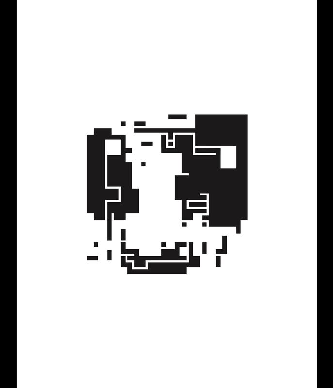
Black Squares and Hierarchy
|
This was the first major project our class completed and it was a good introduction to communication design. The assignment focused on practicing with hierarchy mainly, but also proximity and contrast. Hierarchy is used an all forms of design, there is some information that is more important than others and designers need to display that.
|
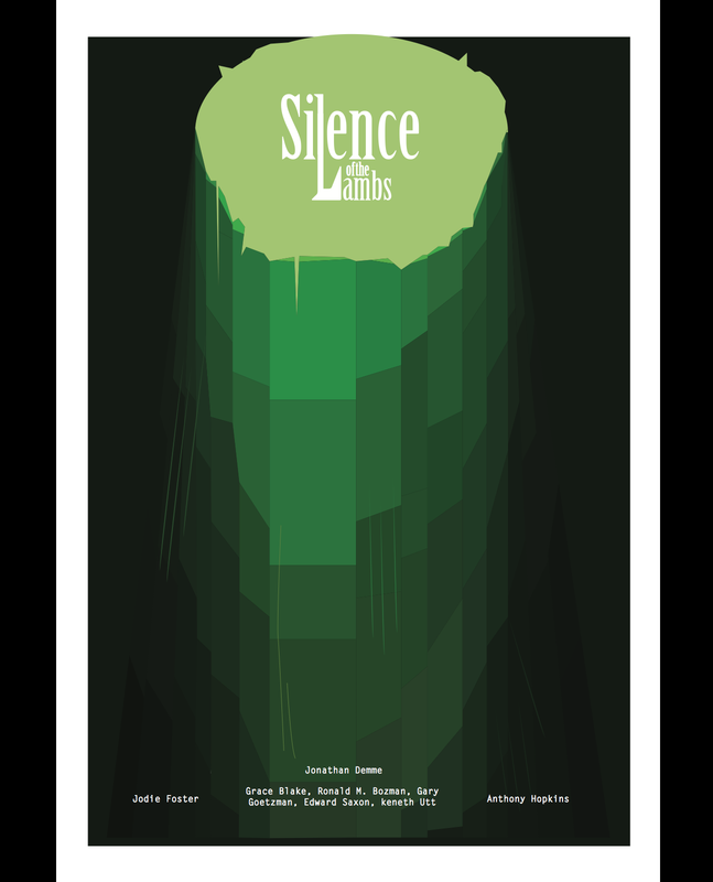
Movie Poster
|
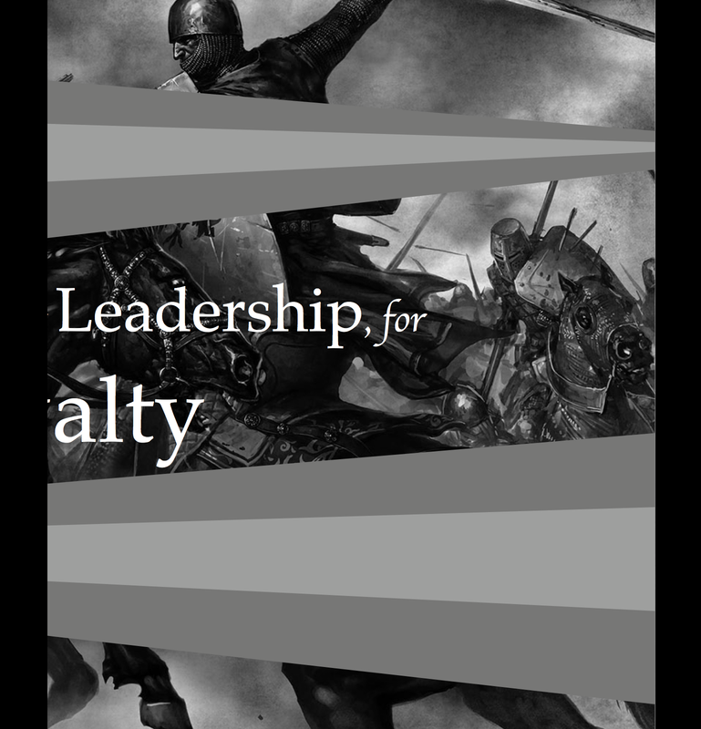
The third project was by far my favorite, and it was mostly because of the freedom we had to do it with. The idea was to create a whole new movie poster for a movie that you had to watch, and take notes on in class. The notes were to review later, for symbolism and imagery, there were some guidelines but the biggest few were to not copy elements from the old poster, use the terminology we learned in class, and develop a working color scheme. The project started with ten thumbnails, that had enough detail to show the professor your intentions. Those ten were brought down to one or two developed sketches to show the class, and have critiqued. Finally one sketch was chosen and it was developed further using the program of choice.
|
|
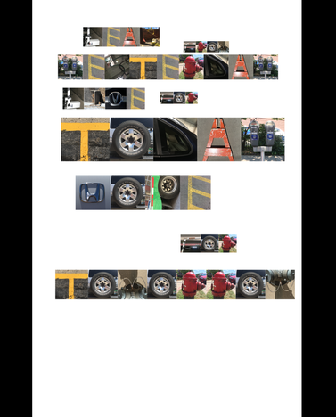
Text in the City
|
This was the second project, and its goal was to help improve how we thought of text. Text in design is so crucial to understand, it's how you sell a brand, or convey a message. We were put into groups to explore the Third Ward and find each letter of the alphabet in an unusual way. Our group chose to relate our alphabet to cars, and traffic. After taking pictures of all of the alphabet, stage two was to crop those letters and create a phrase with them. Like the previous projects it was important to remember hierarchy.
|
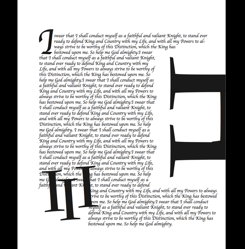
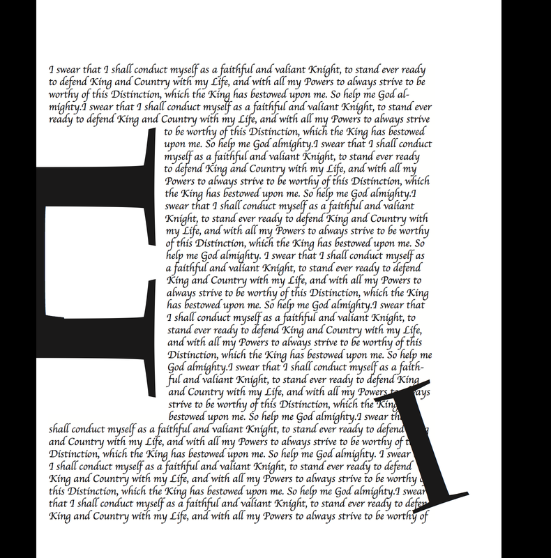
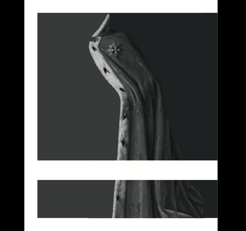
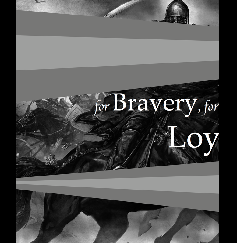
Random Wiki
|
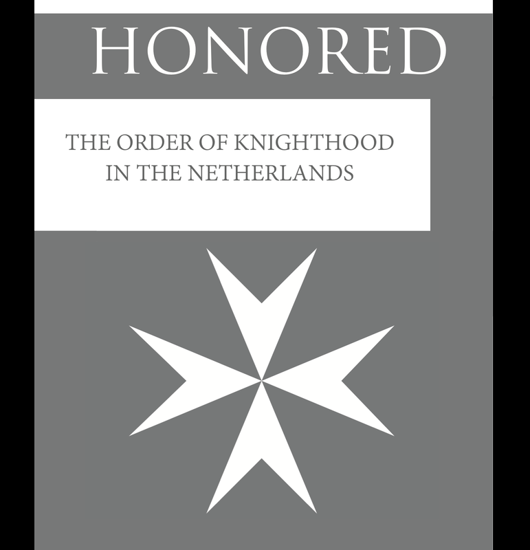
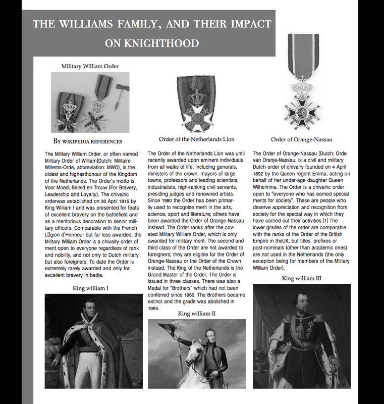
This was the last project and by far the most difficult. We had to chose a wikipedia page that had been randomized. Students got pages ranging from orders of knighthood in the Netherlands, to diarrhea. There was no way to be ready for the topic you were given. once the topic was chosen, using indesign everyone had to create a short booklet about their topic. One page was pure text, the next was pure images, the third was a magazine like spread, and the last was what you wanted. Indesign allows the user to combine skills with photoshop and illustrator to create one piece. It was a brand new program to me which presented challenges, but the biggest was merely time. When you are not familiar with a computer program you are unable to work efficiently and I ran into this problem. I was able to finish with the help of my professor, and his tips on how to get things done.
|
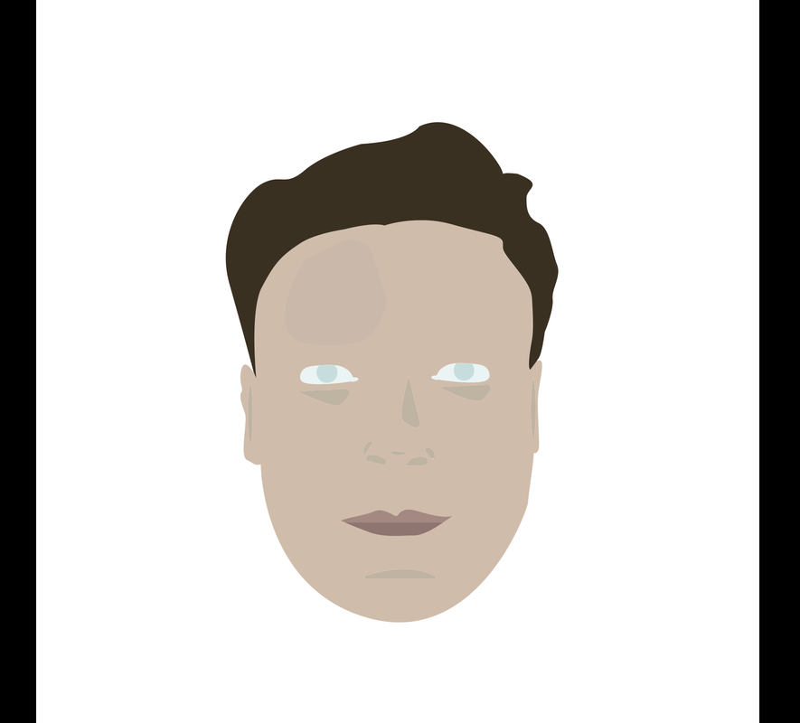
Rendering of myself
|