
|
Poster
Reach 40.64 X 50.8 centimeters November Exhibition text- This piece was inspired by propaganda posters, but also sally Duback use of the butterfly in her work, which was the light element. This poster is about contrasting views, and how I am constantly reaching for perfection. The red represents the darkness, or pain that we all try to escape, for the peaceful tranquil blue. |
Inspiration
|
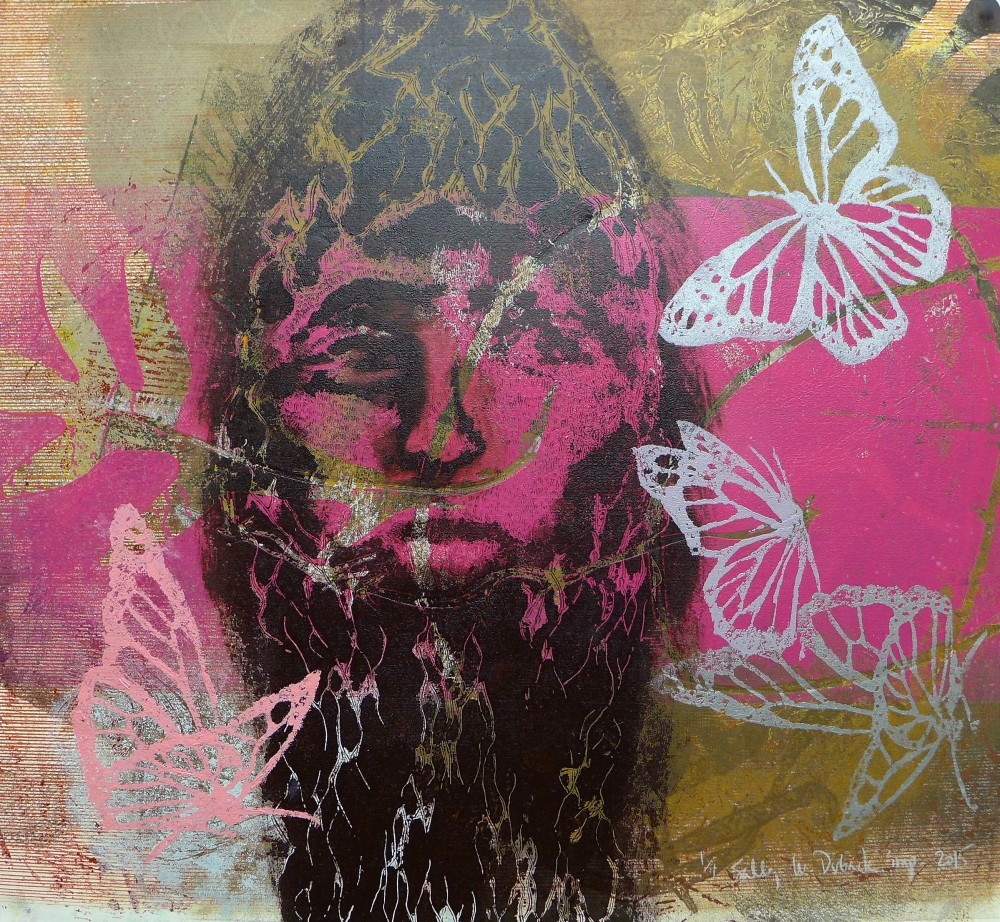
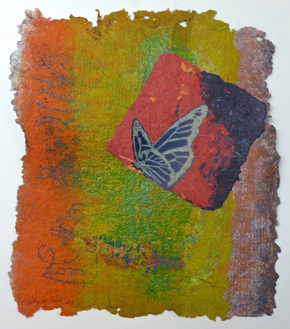
My inspiration for this piece is Sally Duback’s printmaking works. Her prints of butterflies are incredibly colorful and vibrant, as well as russian propaganda posters. I wanted to convey a stern message through the use of propaganda posters, But I wanted to convey life through the softer imagery of butterflies that Duback uses in her work.
|
Planning
|
|
|
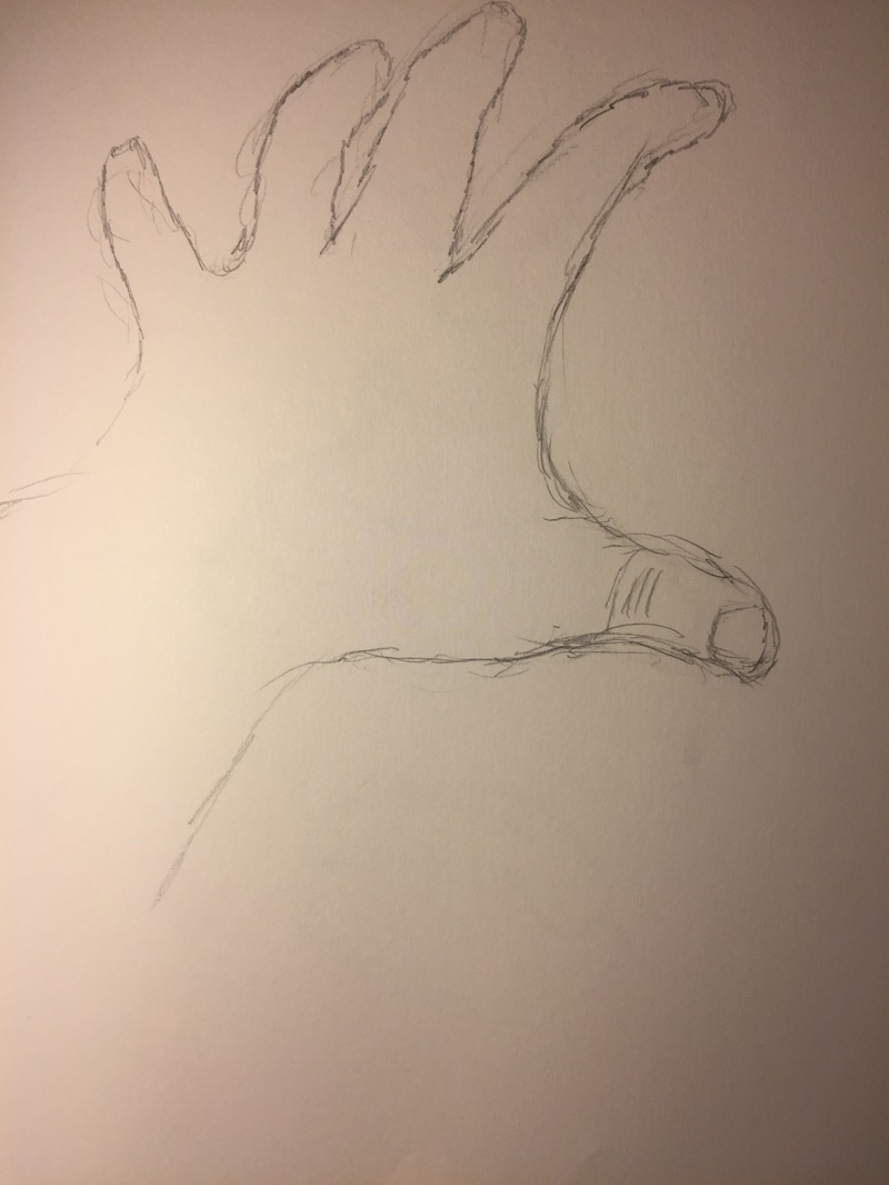
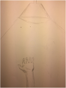
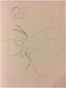
Looking at my inspiration, I started by making some sketches of what I wanted. I felt that it was important to sketch out the symbols that I wanted to draw from the inspiration. First the reaching aspect of the poster. I wanted to have a cry for help, and this is best represented with a hand asking for help. In Order to sketch, I held my left hand to the sky, grasping the air. My own arm was my reference for the sketches. I started with a wide view of a hand, I drew a light source facing down, then added an arm facing up. I then focused in on the hand grasping for something. I then moved on to thinking about the life aspect of my piece. I looked at some imagery of butterflies, and sketched out a more realistic approach.
Process
|

|
|
|
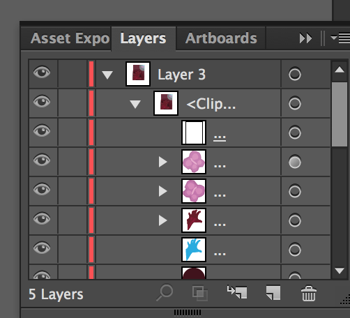
Once I had my sketches, I made my final decisions on what I wanted. I liked the idea of a far away view of a hand reaching to the sky, But after going over my options, the closer up view, would increase the contrast, which would help to convey the meaning of opposing sides. After sketching butterflies from images, I realized I wanted a more stylized version of a butterfly. I started with making the butterfly shape, and adding detail in on adobe illustrator. I was able to draw the initial shape large, then I selected the drawing, and made it small. The change in size was important in showing how significant the smallest amount of joy is. I used the image of my close up hand, and put that into Adobe Illustrator to trace. Once I traced the image it began one whole shape, by using many layers of this shape, I could erase parts from each layer to create form. After completing the hand, I moved the hand into position, which was the bottom left. This choice was matched by a light source in the upper right hand corner, which I placed the butterflies. The light source consisted of rings, that diluted as they grew, and this was matched by a sort of darkness. This darkness was created by opposing dark red rings.
Reflection
I felt that I was really successful in simplifying the meaning of my inspiration in order for the viewer get what the poster is for. I want people to view this poster I realize how hard it can be to grasp what we want, yet it can be so worth it to get out of the struggles. I also used contrast to show two opposing sides, and I think that I was successful in doing so.
ACT
1) My inspiration, was Sally Duback, specifically her work in prints.
2) My point of view on design, is that it uses harmony to convey order. This order is overshadowed by the man at the top, which is perfectly centered on the page, adding to the balance.
3) People need to be drawn in to art, if you don't create a space for them to pay attention, you will lose them. Meaning, needed to be clear, using unity to present the most relevant is crucial for an artist.
4) The theme of the research was why does Duback make the choices to orientate the men in suites in such an order. Why does the background seem so unnatural? How can I create a background that has a meaning like Duback?
5) I made the inference that the Hand was in trouble, I did this through choice of hue. The contrast of the red rings, surounding the hand, to the small piece of blue that holds butterflies.
Citations
Duback, Sally. "Sally Duback Studio." Sally Duback. N.p., n.d. Web. 13 Nov. 2016.
