|
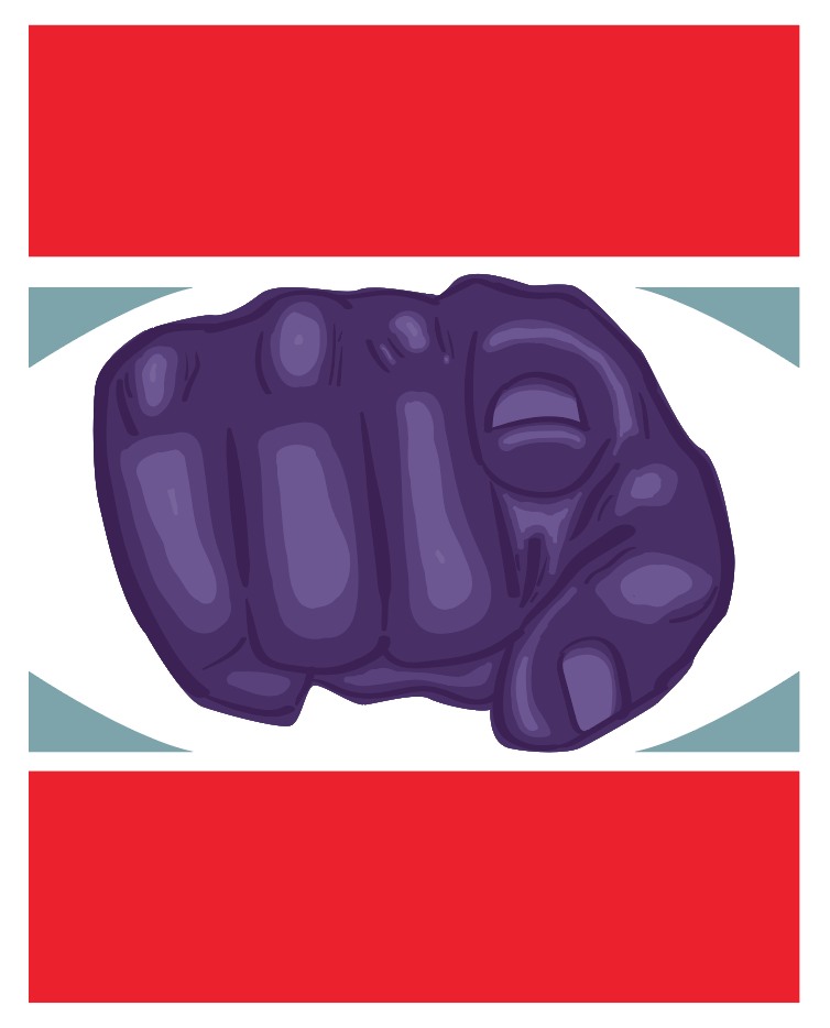
WE NEED YOUPolitical propaganda poster
21.59 X 27.94 September Exhibition text- This piece is inspired by Russian propaganda posters. My concept for this project came from the current election, and the political race in general. The purple color used in the poster, is meant to represent the mixing of both political campaigns. the top and bottom shapes are red to represent the republican party, and the small triangles are blue for democrats. The pointing finger is calling those to get involved in politics. |
Inspiration
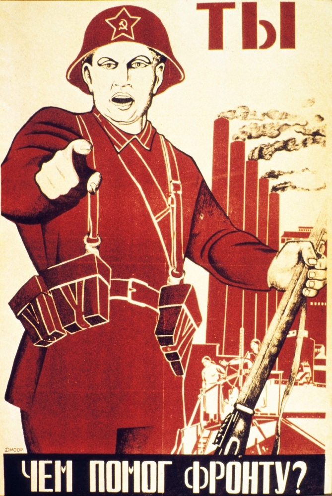
This poster says- "have you aided the front?"
|
I found inspiration from Russian propaganda posters, they seemed to be perfect to help convey my own political message. I used a website resource to view many posters with varying messages, but most were trying to recruit people to communism. The poster I chose to focus on has a man pointing at the viewer, it also says “have you aided the front”. The poster was made during World War II, and the “front” is a reference to the line that divided Russia, and the German forces. There was a constant war, where Germany was pushing against Russia. There was a need for Russian soldiers to defend the line. This message was trying to corral people to Join the fight, similar to my goal to have people join in on caring about politics. I wanted something attention grabbing, and The finger pointing at the at the viewer is a huge focal point. Also the finger pointing, is a symbol for calling to action. Also I wanted to emulate the simplified colors, since they keep the message clear.
|
Planning
|
|
|
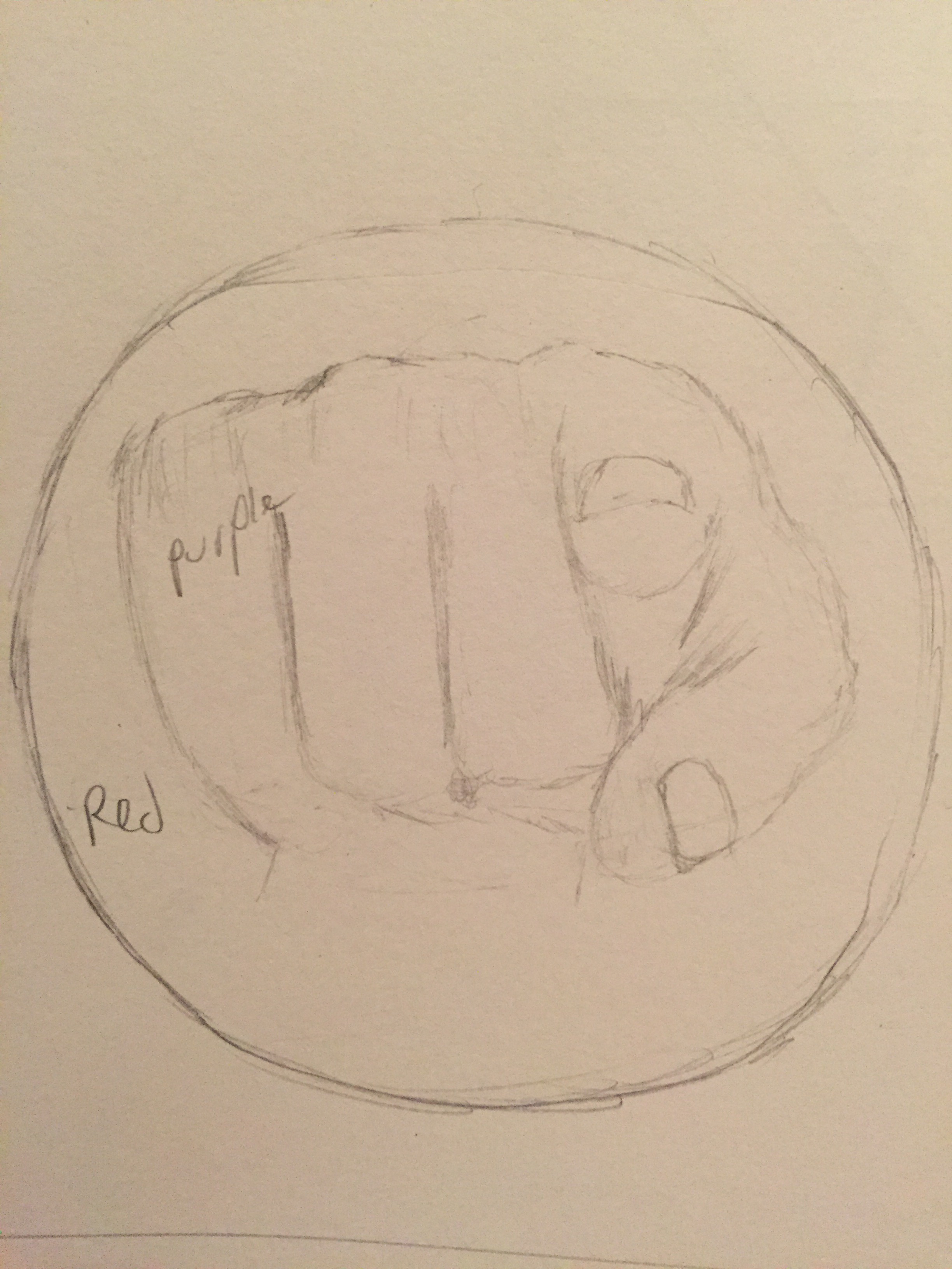
I wanted to start with some sketches of possible posters I could make. There were a few qualifications I wanted to make myself, in order to capture the idea of my inspiration.
1 Keep the design simple
2 Simple color scheme
3 All of symbols should be clear
4 cohesive poster
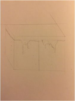
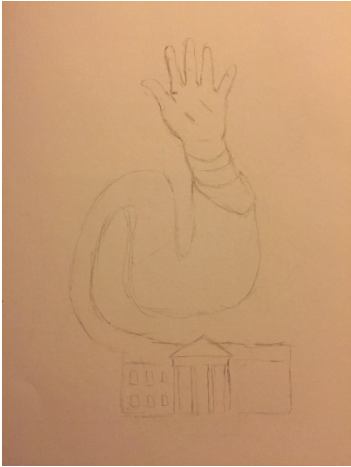
My first sketch used the pointing symbolism, that My inspiration poster had. I wanted to focus in on the hand gesture since that was so important in my inspiration, so my design is just a hand pointing at the viewer. My second sketch is a fish tank, and I divided the liquid within the container. The liquid is divided in half to show the divide between the two political parties. The liquid is also oozing out of the sides of the tank, which is a metaphor for the pressure between the two sides. My last sketch is a hand that is waving connected to the white house. I decided to stick with the hand pointing idea. This concept just made the most sense, it was the most simple, clear and cohesive idea.
1 Keep the design simple
2 Simple color scheme
3 All of symbols should be clear
4 cohesive poster
My first sketch used the pointing symbolism, that My inspiration poster had. I wanted to focus in on the hand gesture since that was so important in my inspiration, so my design is just a hand pointing at the viewer. My second sketch is a fish tank, and I divided the liquid within the container. The liquid is divided in half to show the divide between the two political parties. The liquid is also oozing out of the sides of the tank, which is a metaphor for the pressure between the two sides. My last sketch is a hand that is waving connected to the white house. I decided to stick with the hand pointing idea. This concept just made the most sense, it was the most simple, clear and cohesive idea.
Process
I picked the sketch I wanted to continue with, and started by putting that on a file in adobe illustrator. After posting it into the document, I used my drawing tablet to sketch the darkest parts of the hand. Once I was done with the tracing of the hand, I was done my previous drawing. To create the shading of the pointing finger, I used a technique that I learned from a video on making a different art project. I created a circle shape over the finger, and copied that shape 4 times, for each of the circles I had different colors. The circle on the top layer was the darkest, and the last layer was the lightest. I was able to erase shapes out of each of the circles, in order to create shadows and highlights.
Reflection
I felt that I found a lot of success in reaching the final product. I was happy with the final product because of the color that I ended up with. I felt it was really useful in using hue. The color of the pointing hand, being purple was in hopes of sending a message to unite people. Also the symbolism of the pointing hand is clear and simple enough for any one to see.
ACT
1) My inspiration, was Rusian propaganda posters, specifically a poster asking the viewer if they have joined the front, or battle.
2) My point of view on design, is that it uses important elements like hue to draw the viewer in, and keep them there. Balance is crucial in conveying the viewer to join.
3) People need to be drawn in to art, Which is why I chose A smybol pointing directly at the viewer. The meaning behind my work is more clear through the use of a simple color scheme, and emphasice on the hand.
4) The theme of the research was why do Propaganda posters make the choices to call out the viewer with text. Why does the background Hold imagery of machinery?
5) I made the inference that the the "front" is the war against Nazi Germany, this poster is asking the viewer to join the fight, with the possibility of death. The emphasize however on the simplicity, is a reference to how the creator of the poster wants the viewer to feel the choice is simple.
Citations
Lavin, Talia. "35 Communist Propaganda Posters Illustrate The Art And Ideology Of Another Time." The Huffington Post. TheHuffingtonPost.com, 26 Dec. 2014. Web. 13 Nov. 2016.
